CLEER
DELIVERABLES
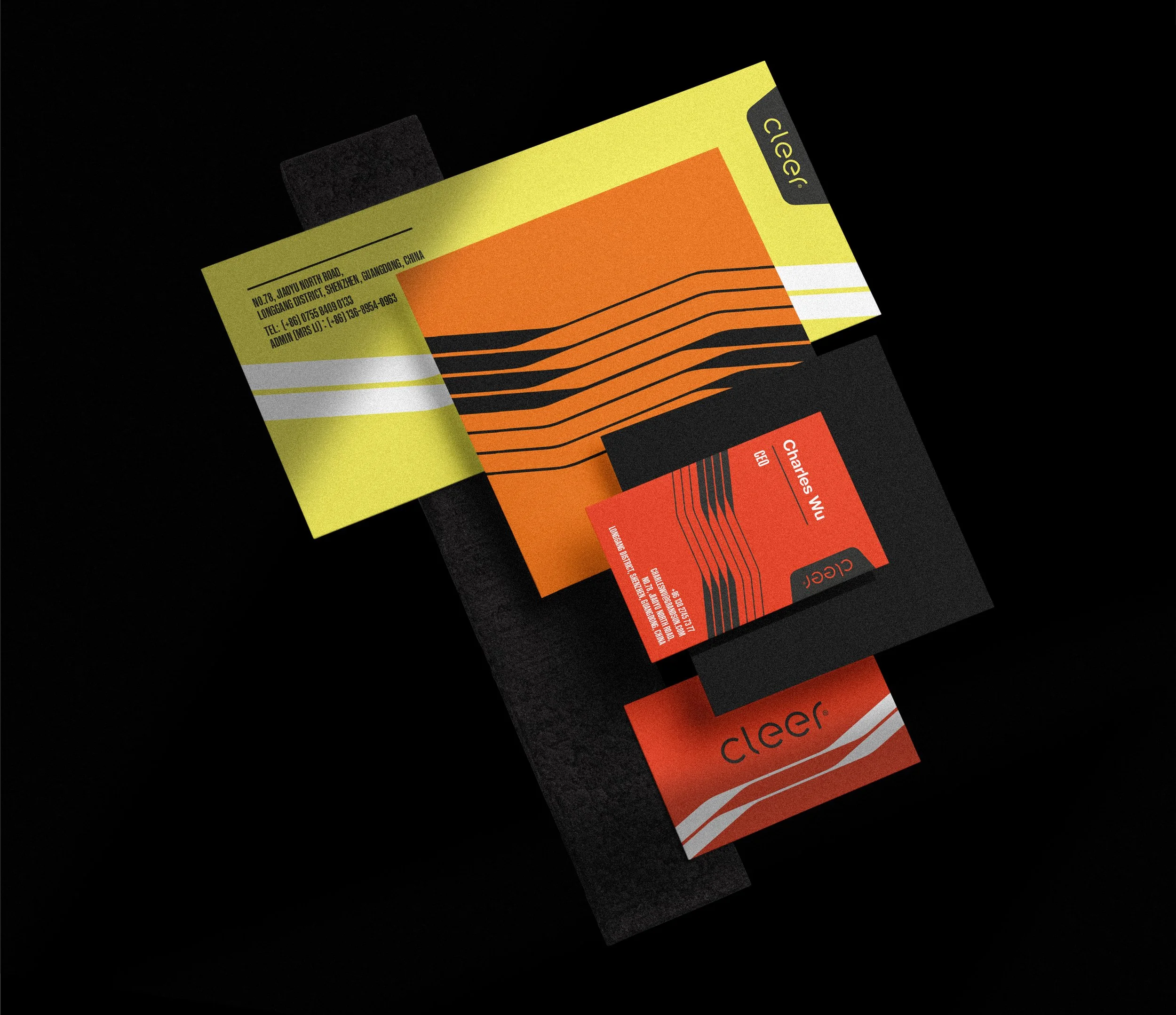
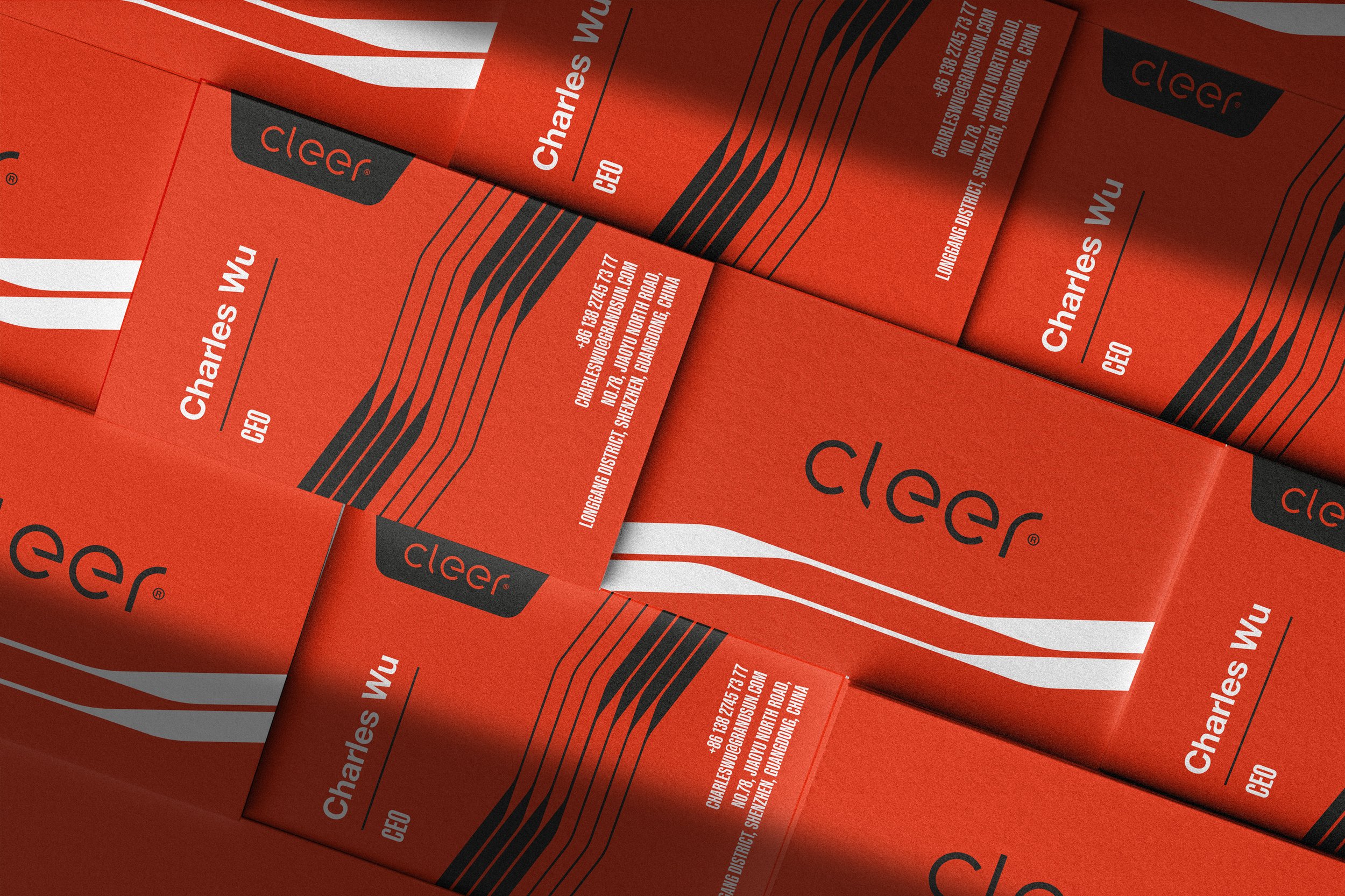
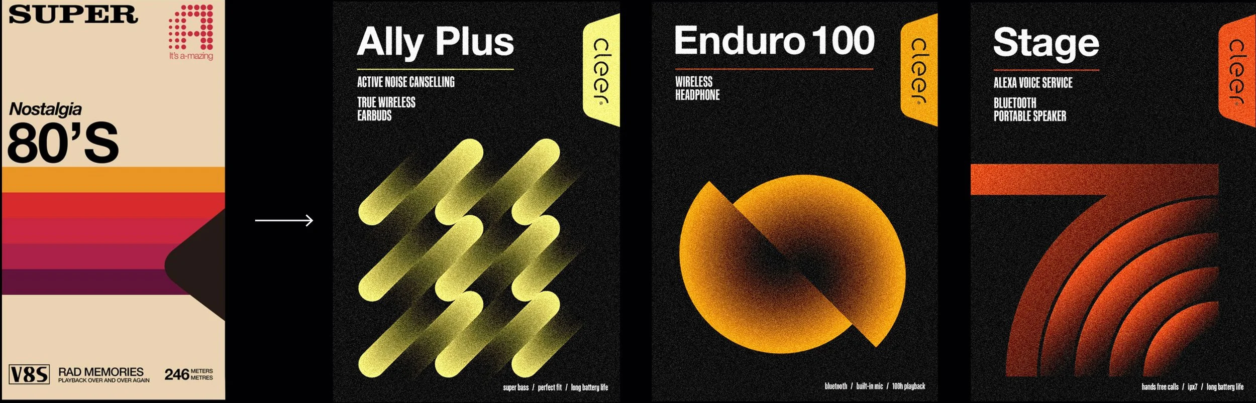
Logotype Update
Visual Identity
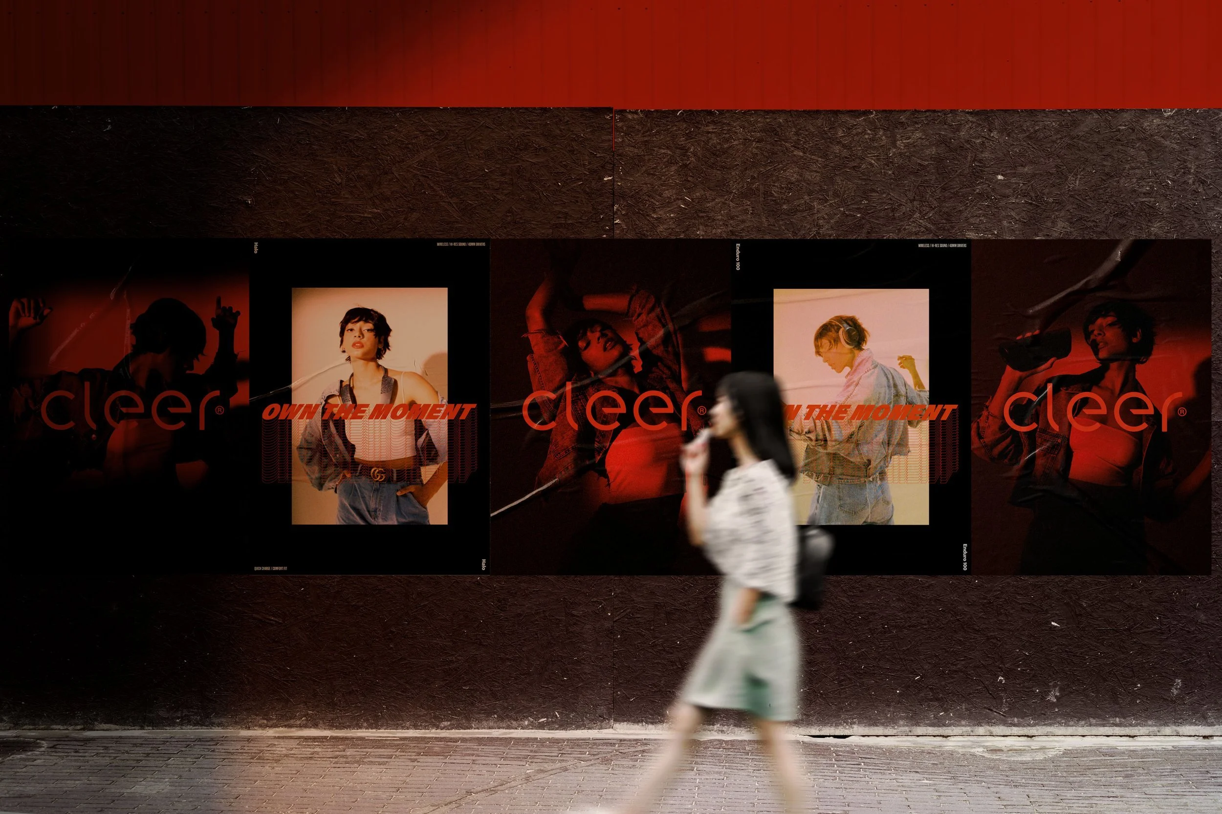
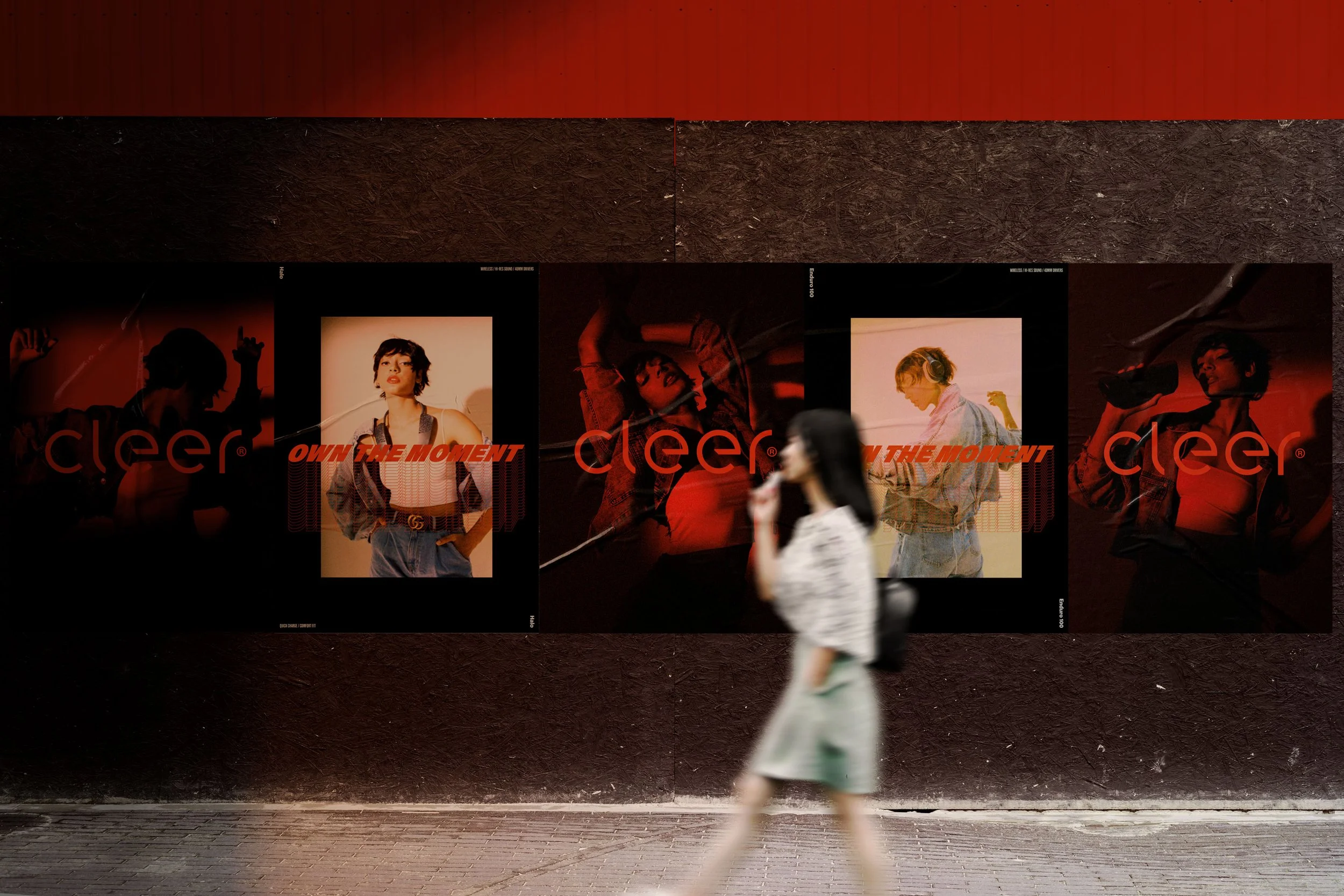
Photo Styling
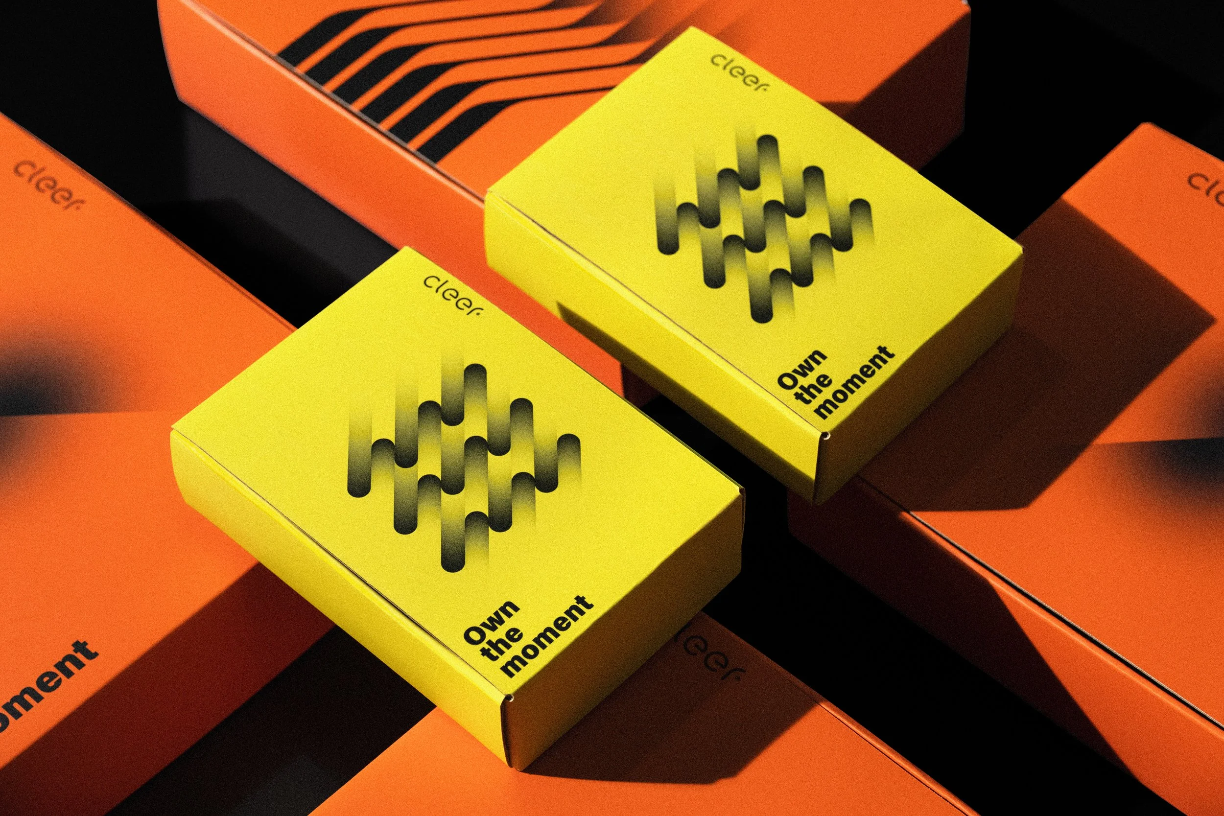
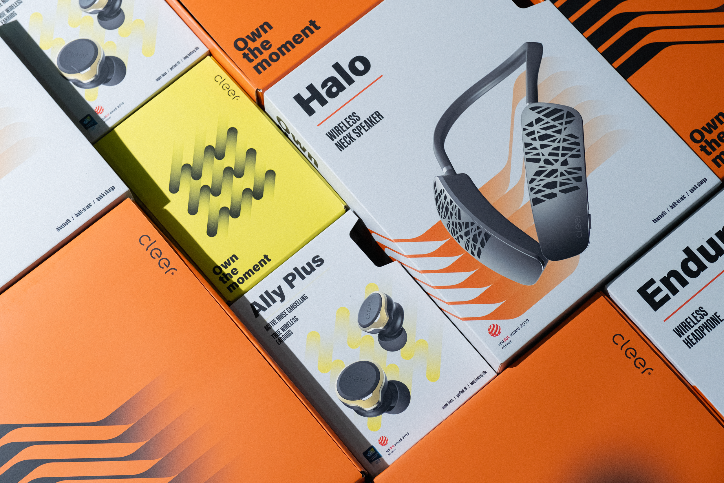
Packaging Design
DURATION
03-08.2020
MY ROLE
Art Director
ABOUT
Cleer is a premium lifestyle audio brand based in California.
THE GOAL
Develop a new, modern brand identity that attracts younger customers.
THE CHALLENGE
The challenge is to align old-fashioned product design with a modern-looking identity and make it attractive to a younger audience outside the USA.

THE PROCESS
RESEARCH
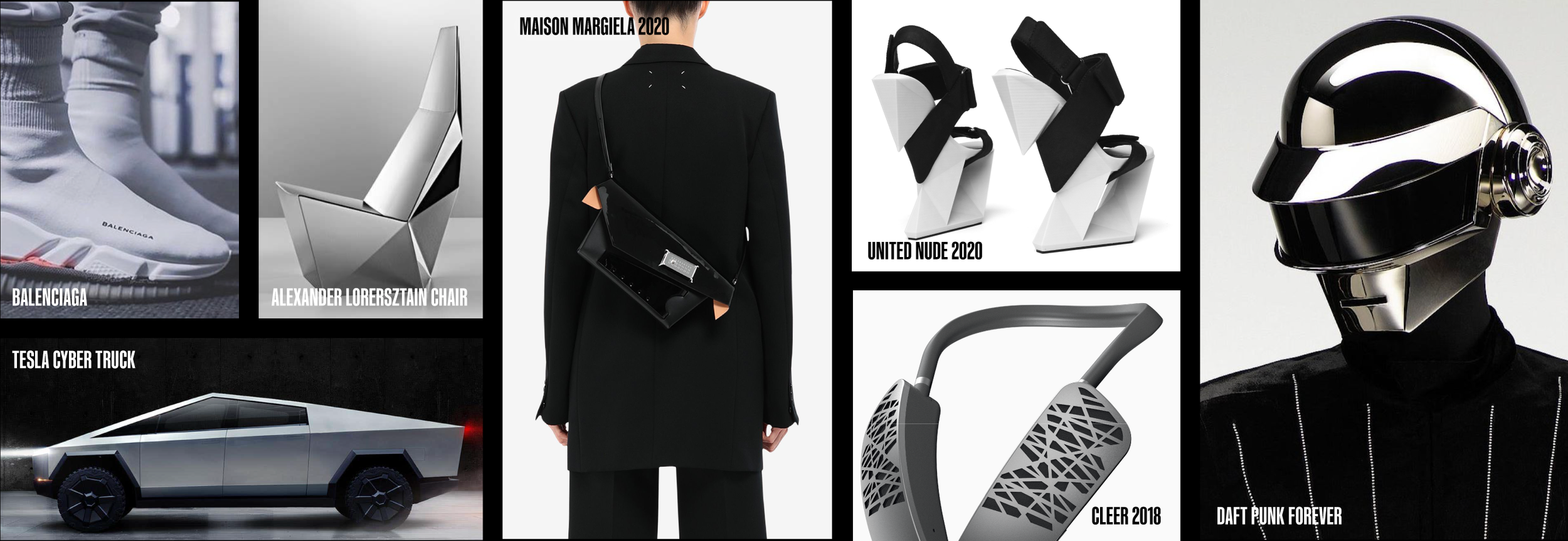
PRODUCT DESIGN LANGUAGE
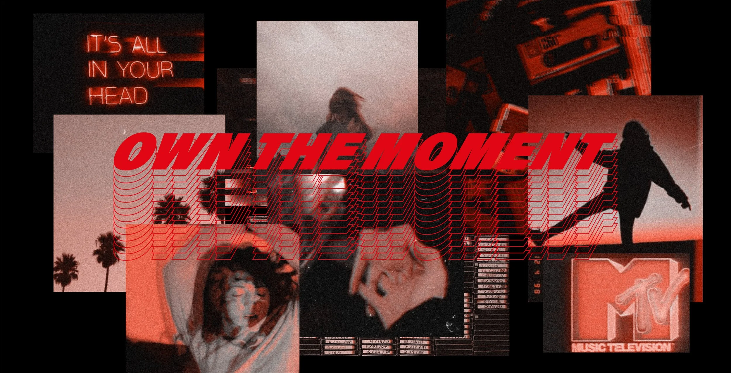
Retro futurism
Sharp edges
Bold and standing out.
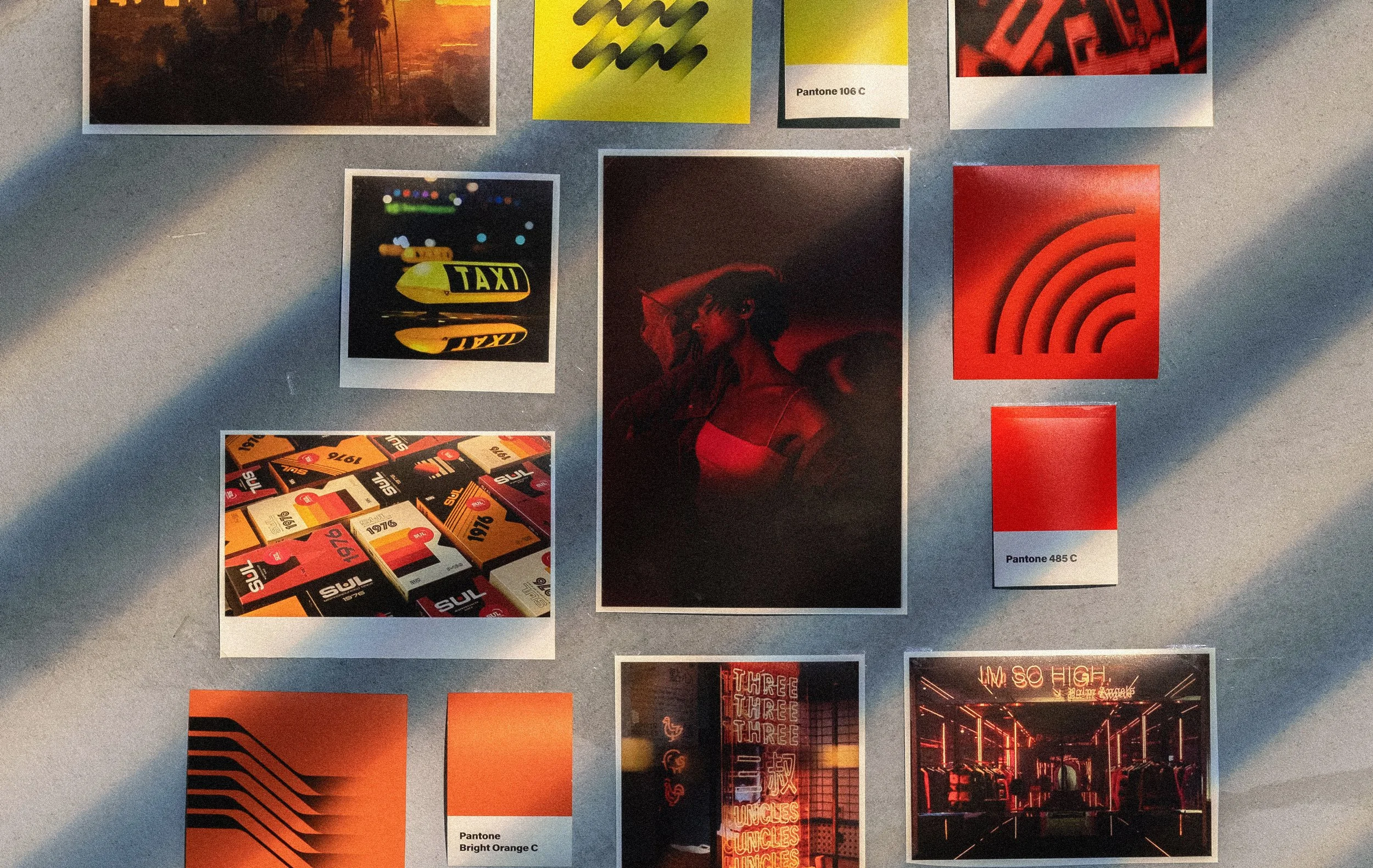
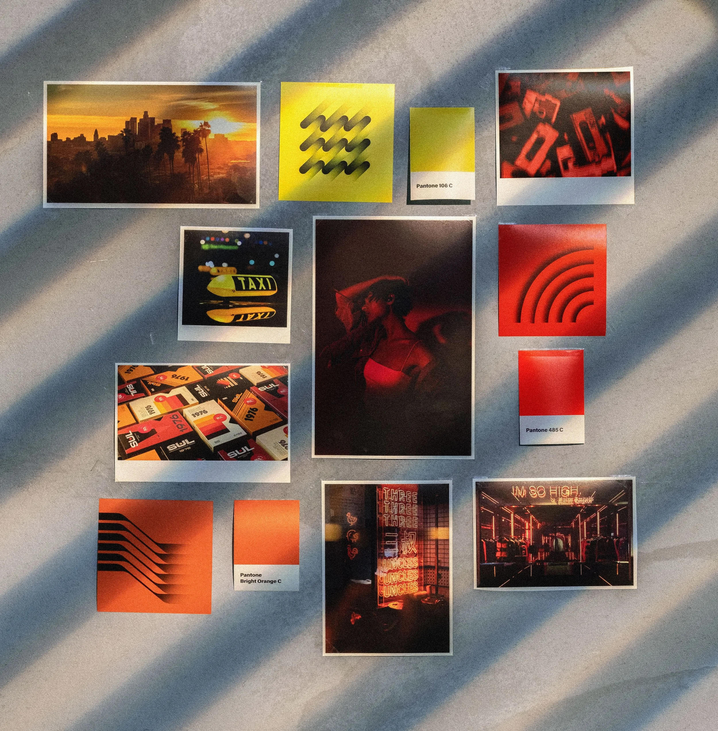
COLOR INSPIRATION
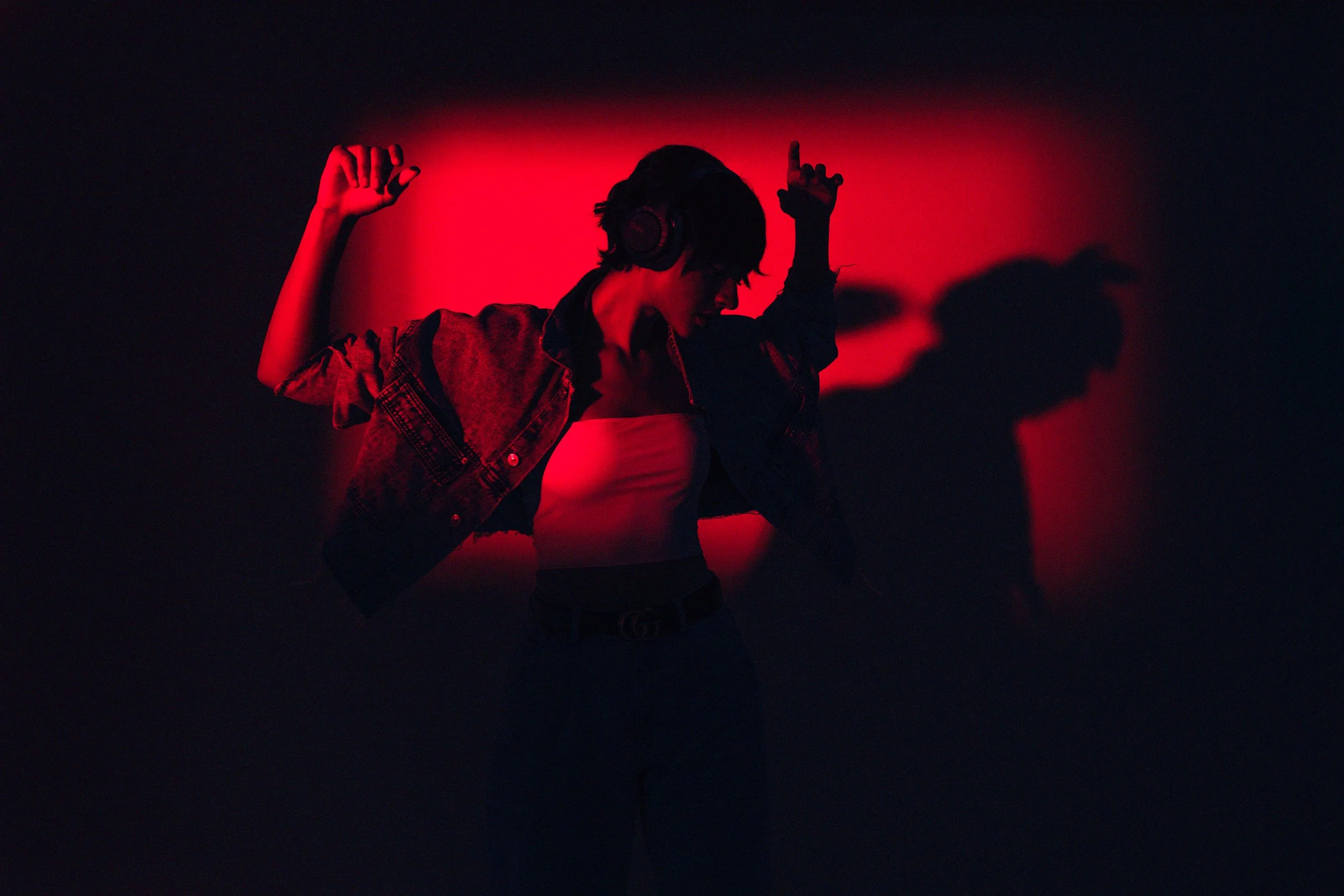
Californian sunset meets the night in Chinatown.
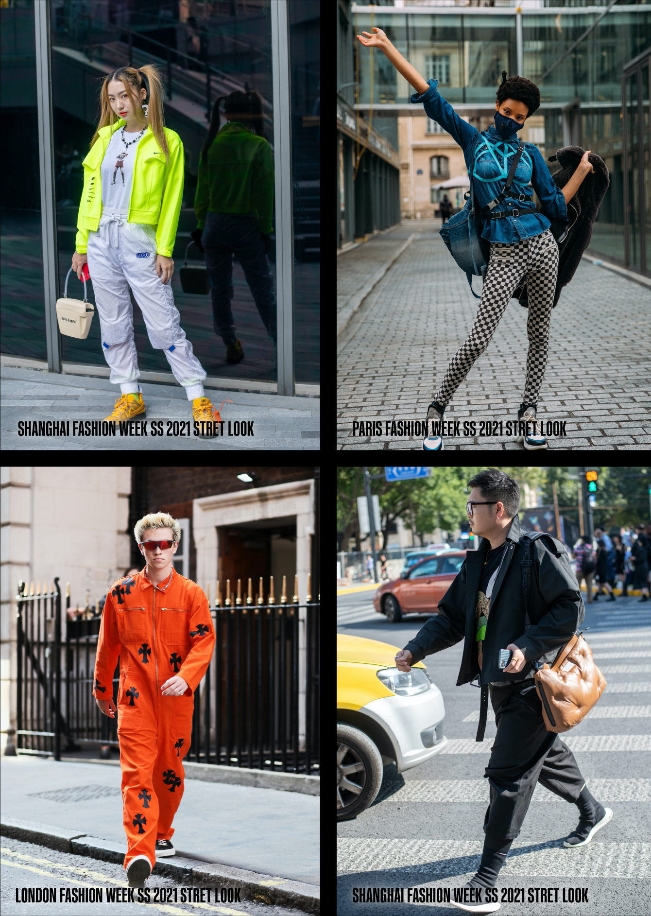
LIFESTYLE TRENDS
Retro flashback
Kitsch
Bold and bright
PERSONA
Alternative
Urbanistic
Confident
Bold accessory lover
Music and movie lover

Cleer is a Californian brand aiming to boost sales in China, and I needed to consider these aspects in my design decisions. To understand what non-American and Chinese people associate with California, I conducted research. One of the most common responses was 'Movies.'
Keeping this in mind, I initiated the design process.

DESIGN
GRAPHICS
I combined research lifestyle findings and color inspiration and came up with idea to take VHS tapes as main reference for a graphic approach.
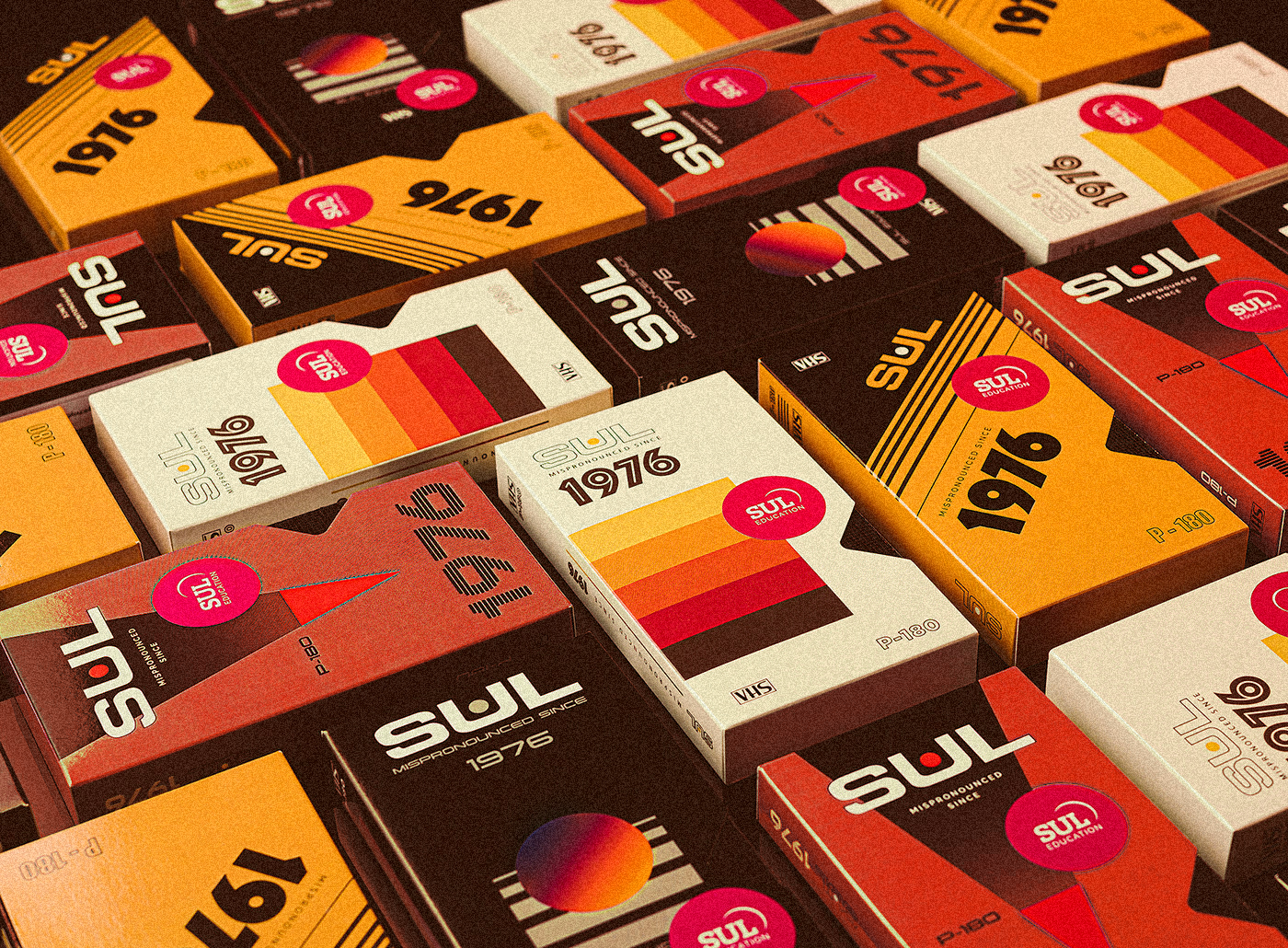
I made some graphic explorations based on the VHS idea:
I kept the layout style and recognisable diecut.
I added modern gradient graphics and noise effect.
LOGOTYPE UPDATE
PACKAGING DESIGN


PHOTOGRAPHY