SEUNOTO
DELIVERABLES
Logotype Design
Visual Identity
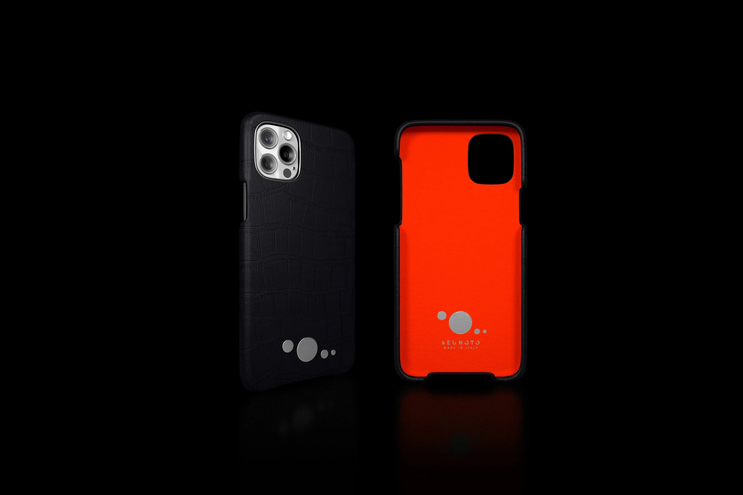
Packaging Design
DURATION
03-05.2021
MY ROLE
Freelance Brand Designer

ABOUT
Seunoto is a luxury fashion accessory brand that works with natural high-quality materials. Seunoto takes inspiration from “Sei Uno Otto’’ divine proportion and creates exceptional collections limited to 618 pieces, the Italian golden ratio.
THE GOAL
Create a logotype that combines the Golden Ratio inspiration with the Braille alphabet.
Develop a brand identity that supports the logo and gives the brand a premium feel.
Design packaging.

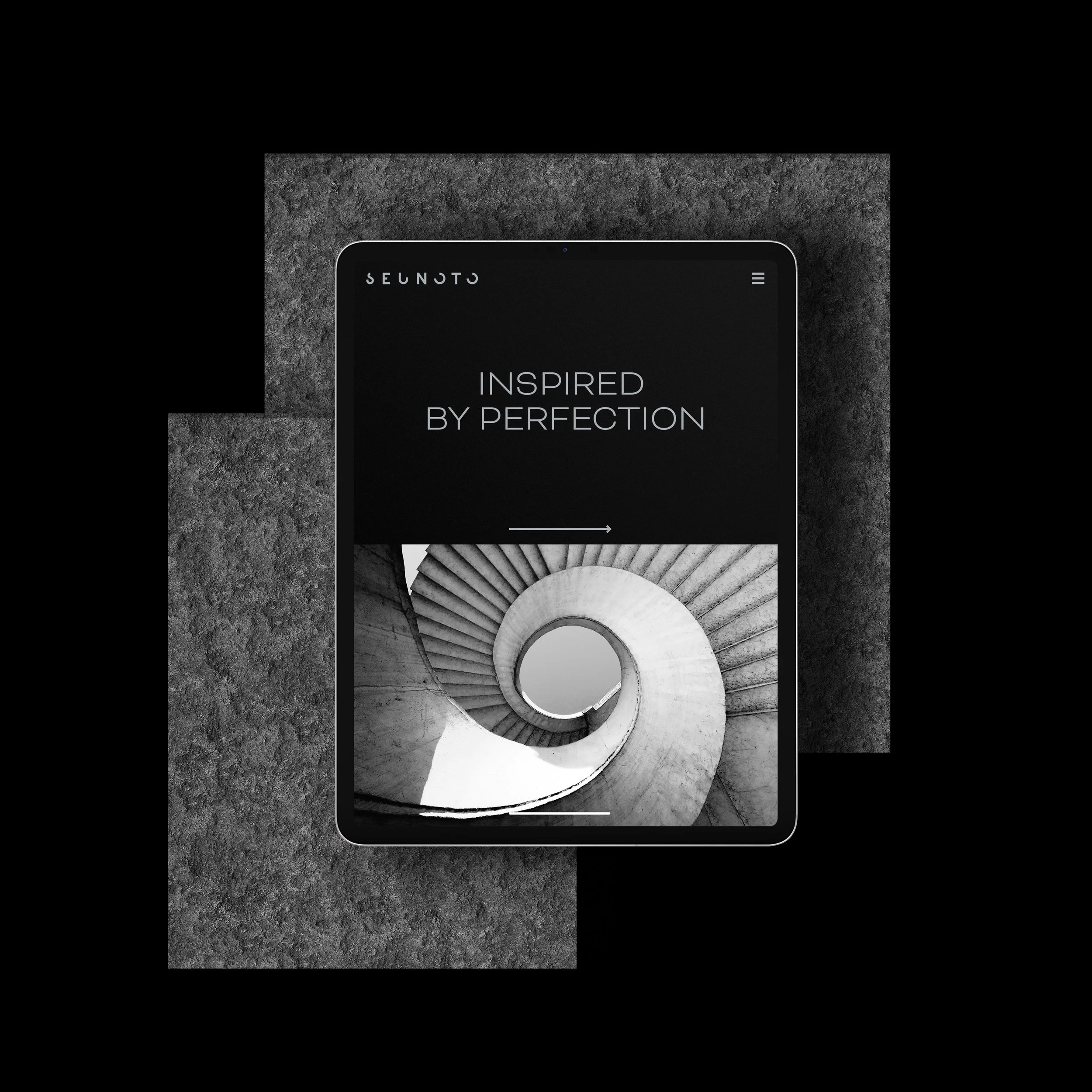
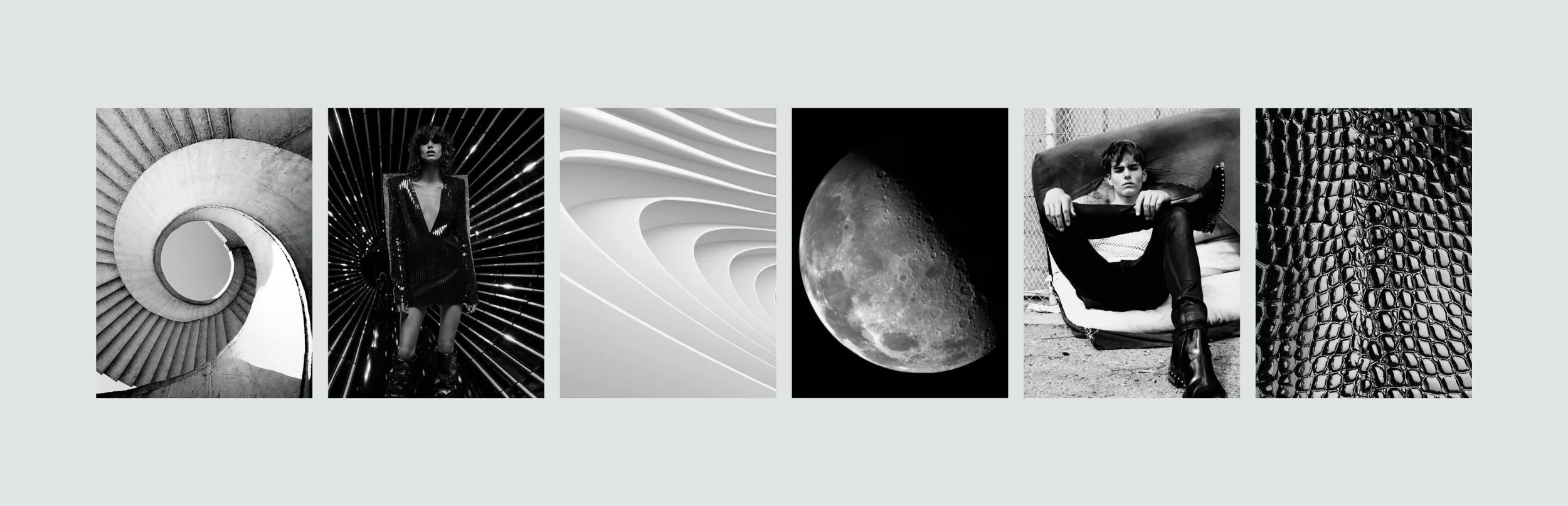
THE MOOD
THE PROCESS
THE BRIEF
To create a logo that is based on Golden Ratio. Take inspiration from fashion brands, and involve the Braille alphabet if possible.
To create a luxury brand identity that supports the product.
To design packaging.
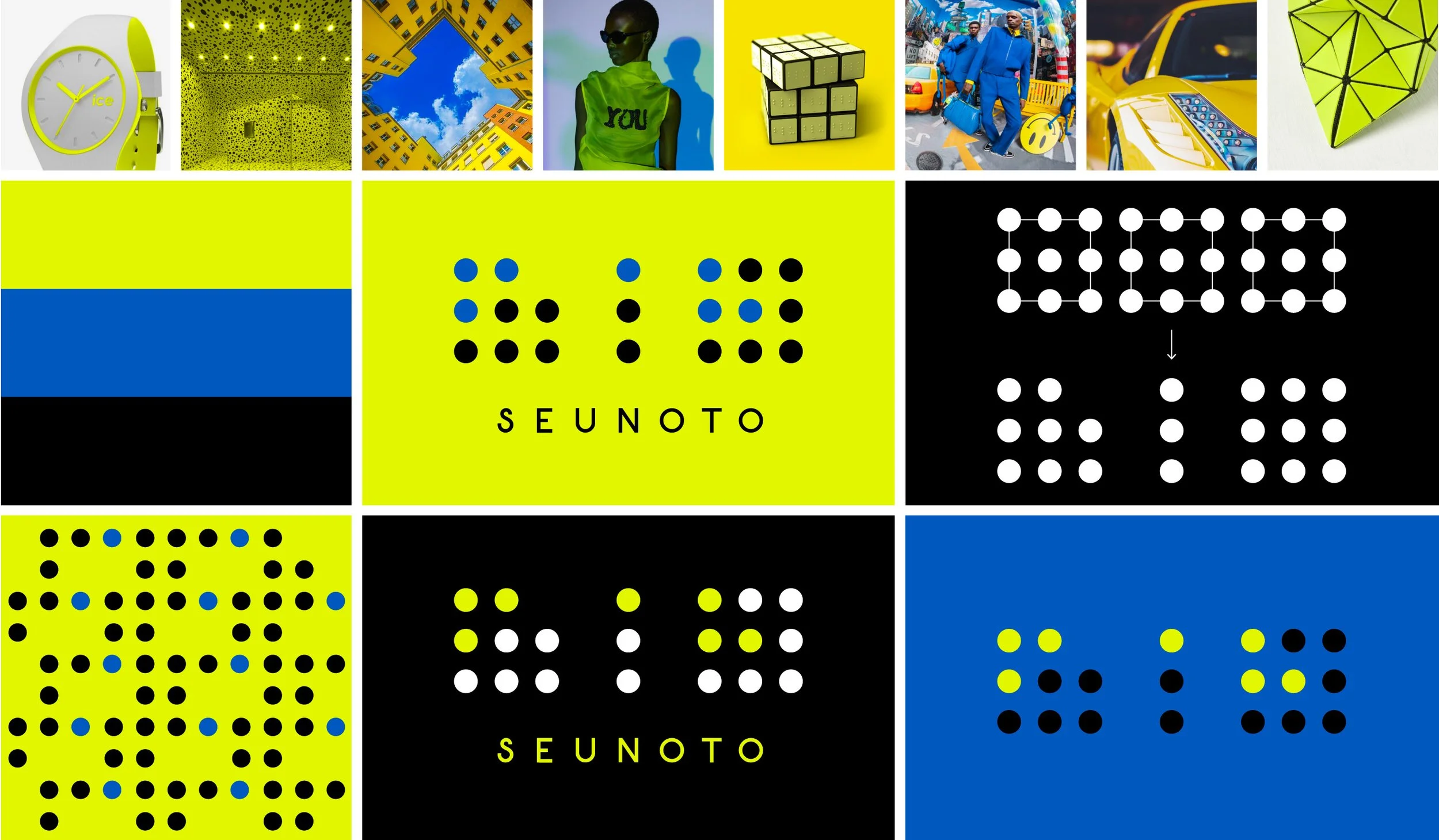
OPTION 1. COLORFUL
Inspired by Louis Vuitton, Issey Miyake, Yayoi Kusama dots, and the Braille alphabet.
OPTION 2. NATURAL
Inspired by Gucci, natural colours and materials.


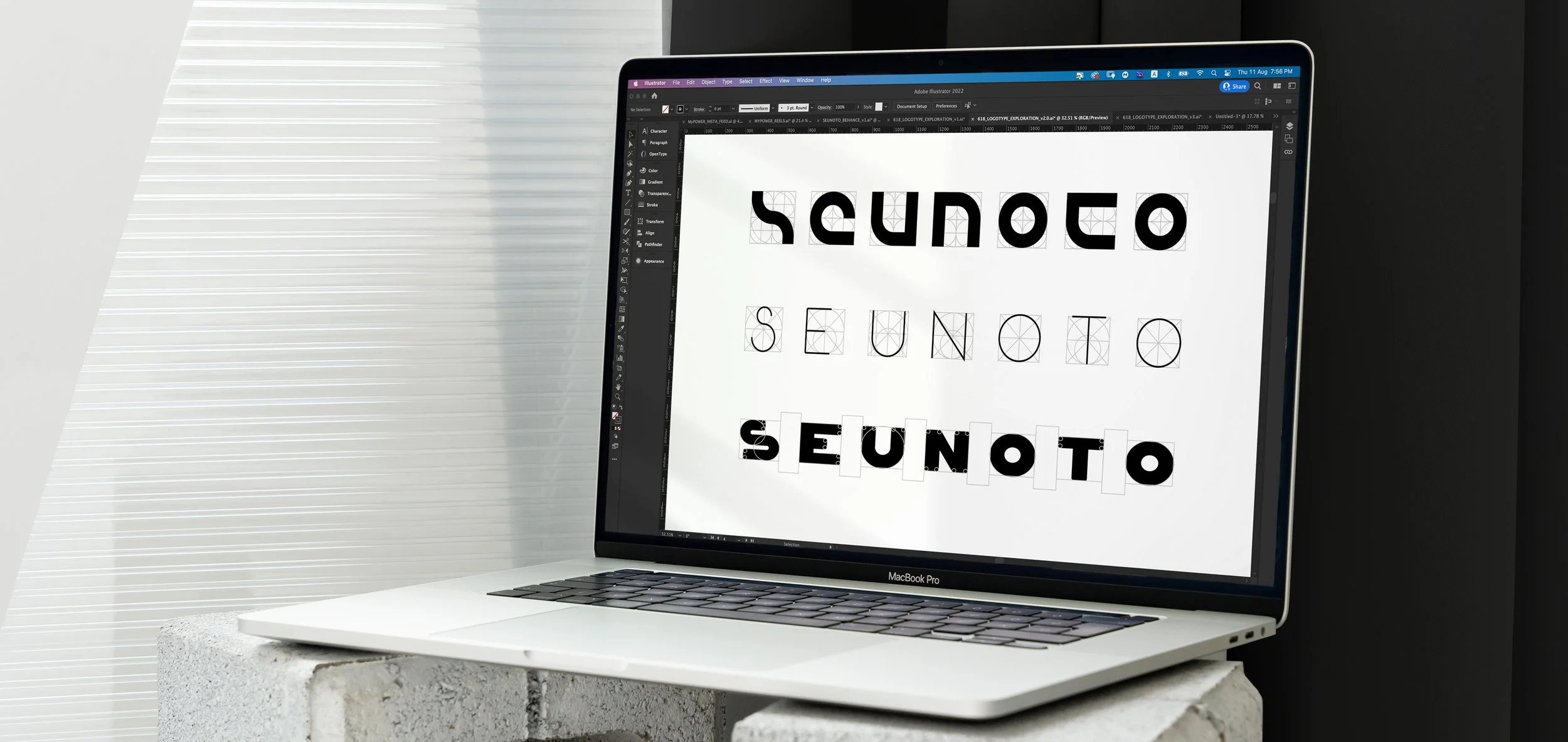
LOGO EXPLORATION
The brief was pretty broad. So I decided to explore different approaches to clarify the design direction.
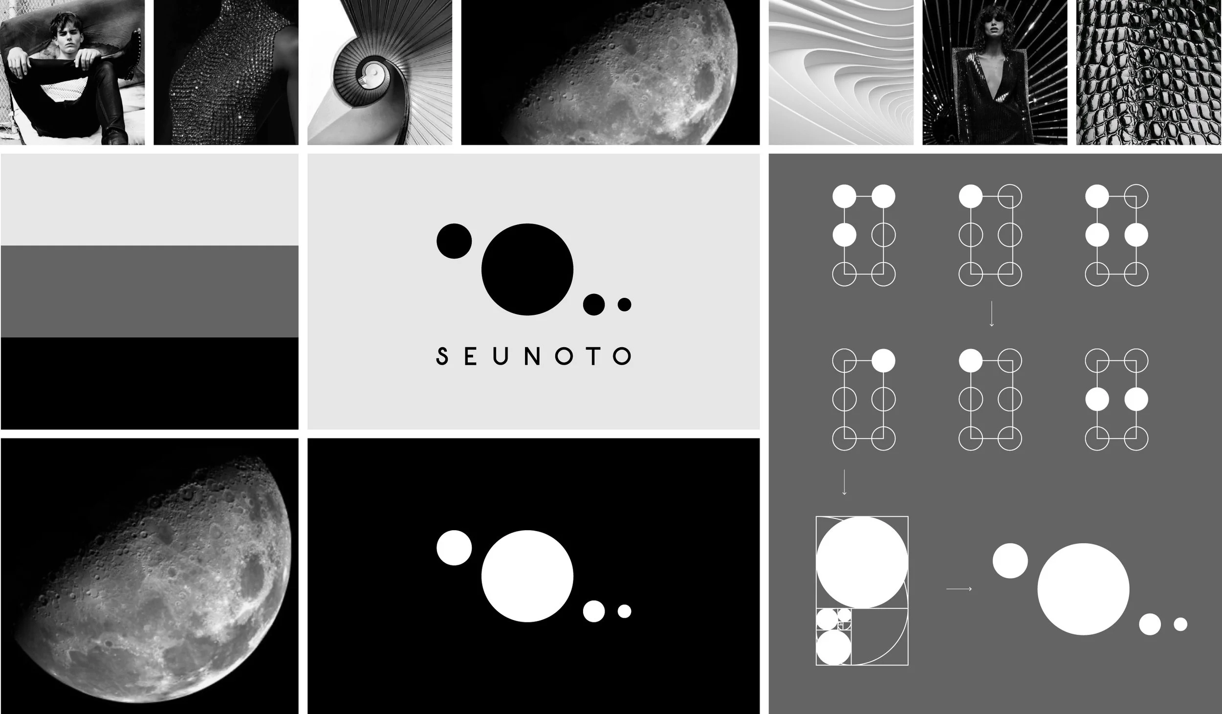
OPTION 3. DARK
Inspired by Saint Laurent, Golden Ratio, Cosmos, and the Braille alphabet.
FINALIZING THE LOGO
After the review, the client chose option 3 for the brand.
I simplified Braille 618 numbers to 4 circles and used the Golden Ratio to make proportions.
I tried different fonts and finishings to determine the best way for the brand.
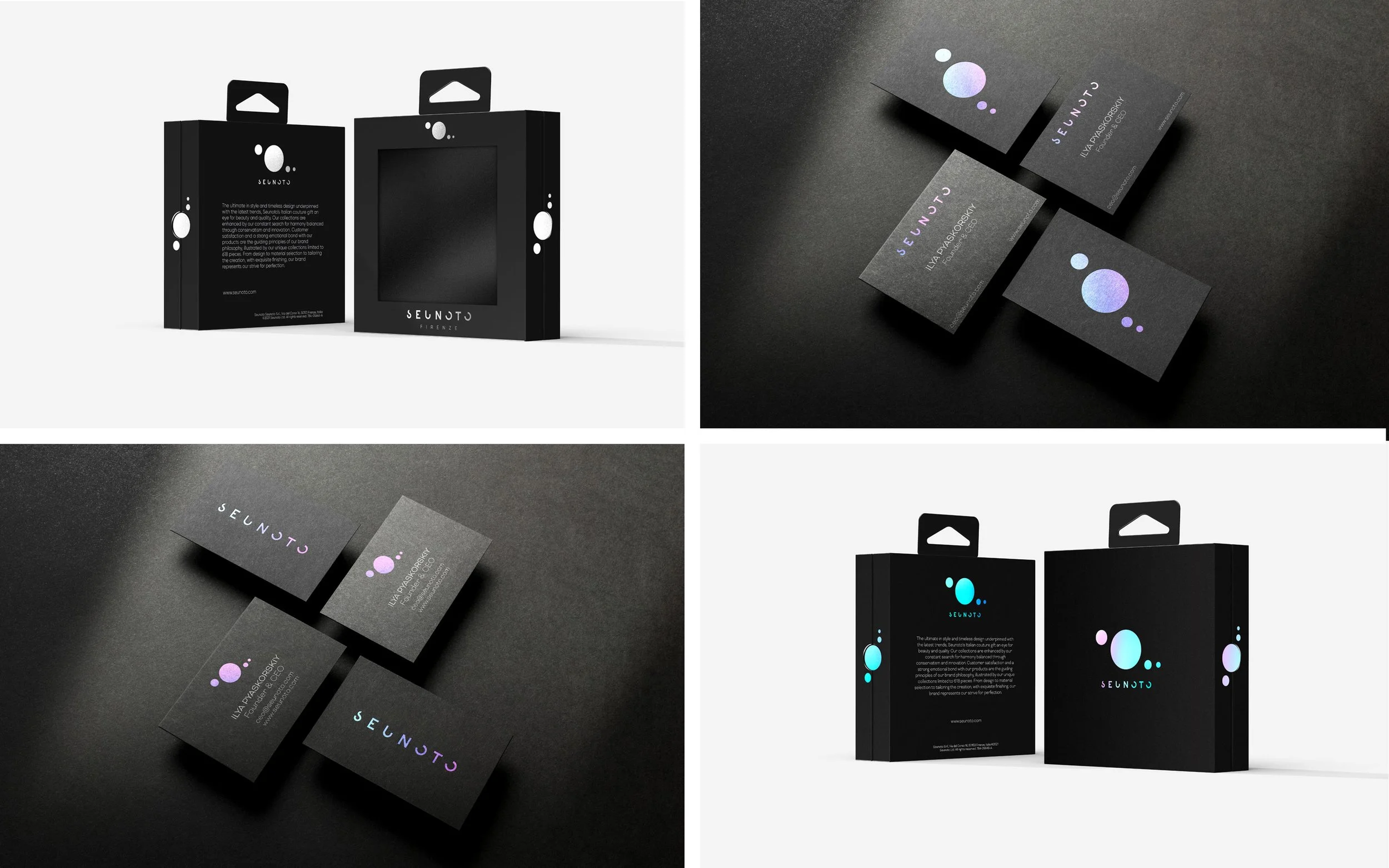
After the second review logo was complete, the client decided to go with the faded font option and use a holographic foil as a finishing for the brand stationery and packaging.
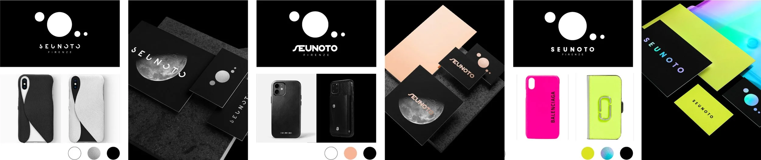
BRANDING AND PACKAGING
To combine a classic approach with a modern vibe, I decided to use a centered layout together with a holographic foil.
I explored several options.