HARMAN/KARDON
DELIVERABLES
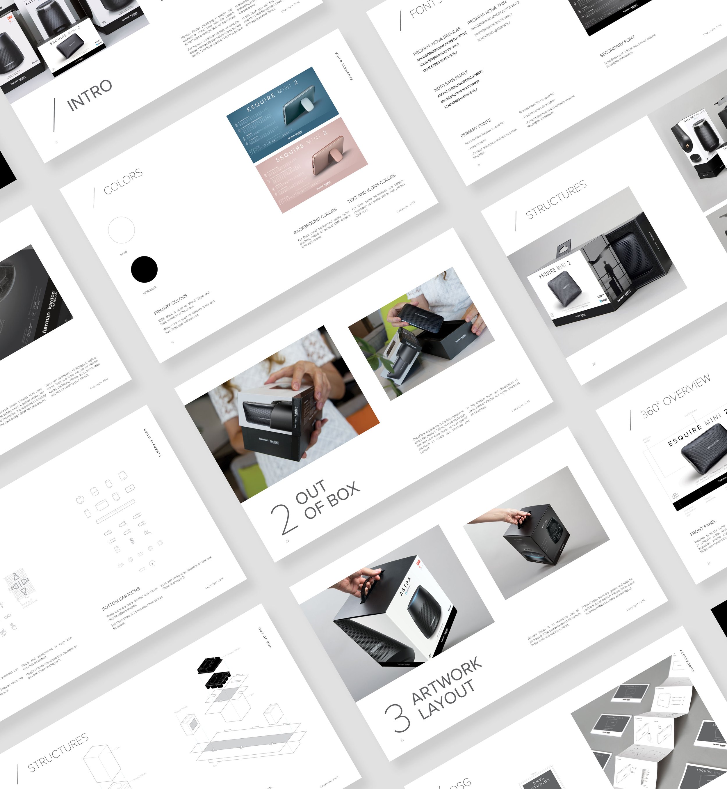
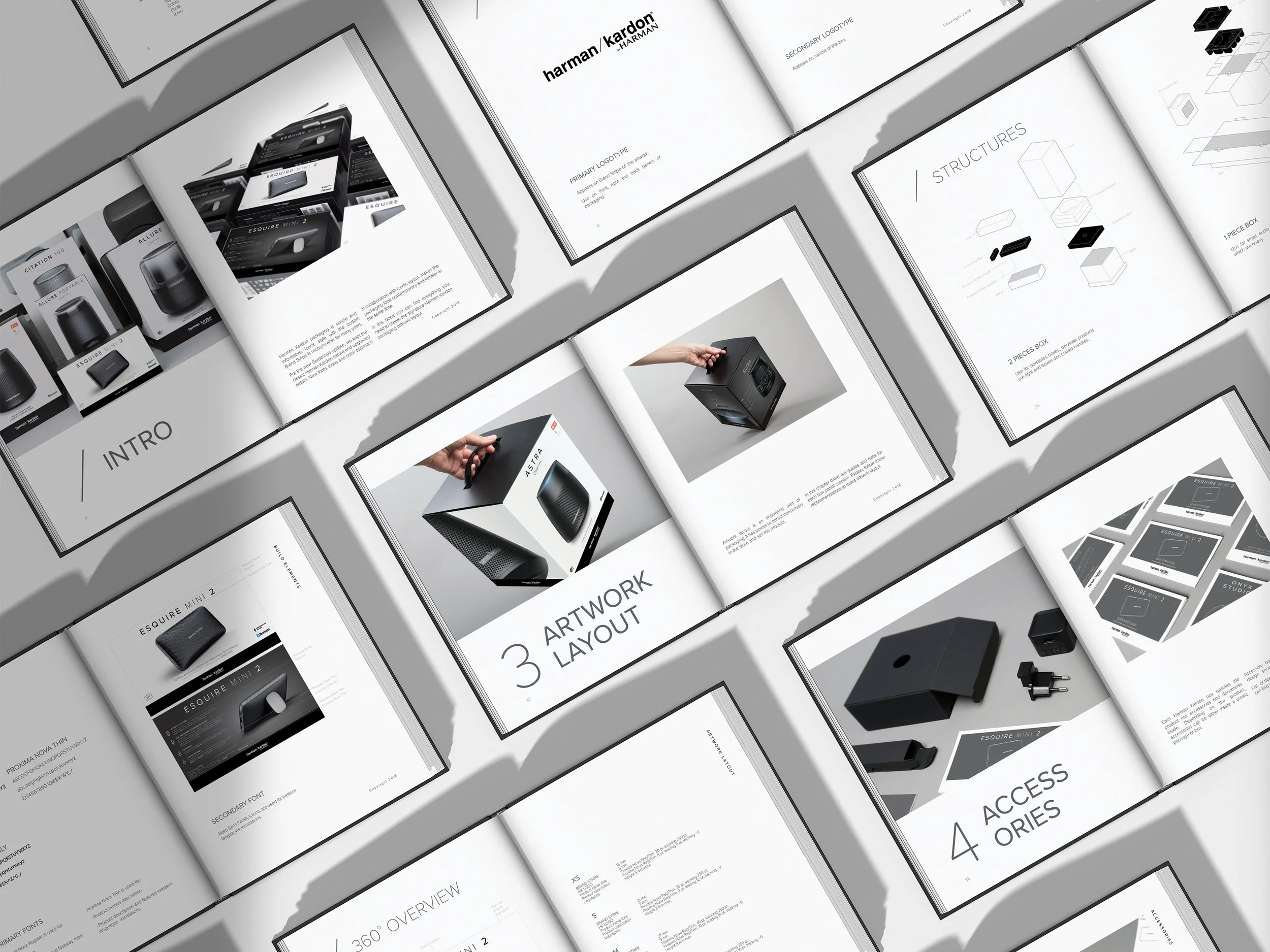
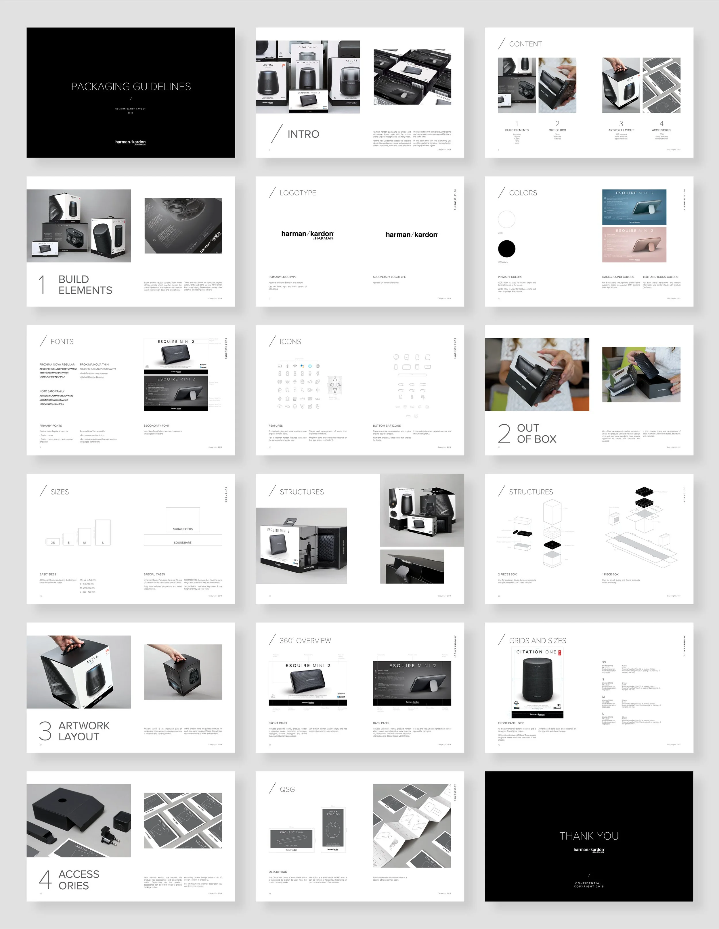
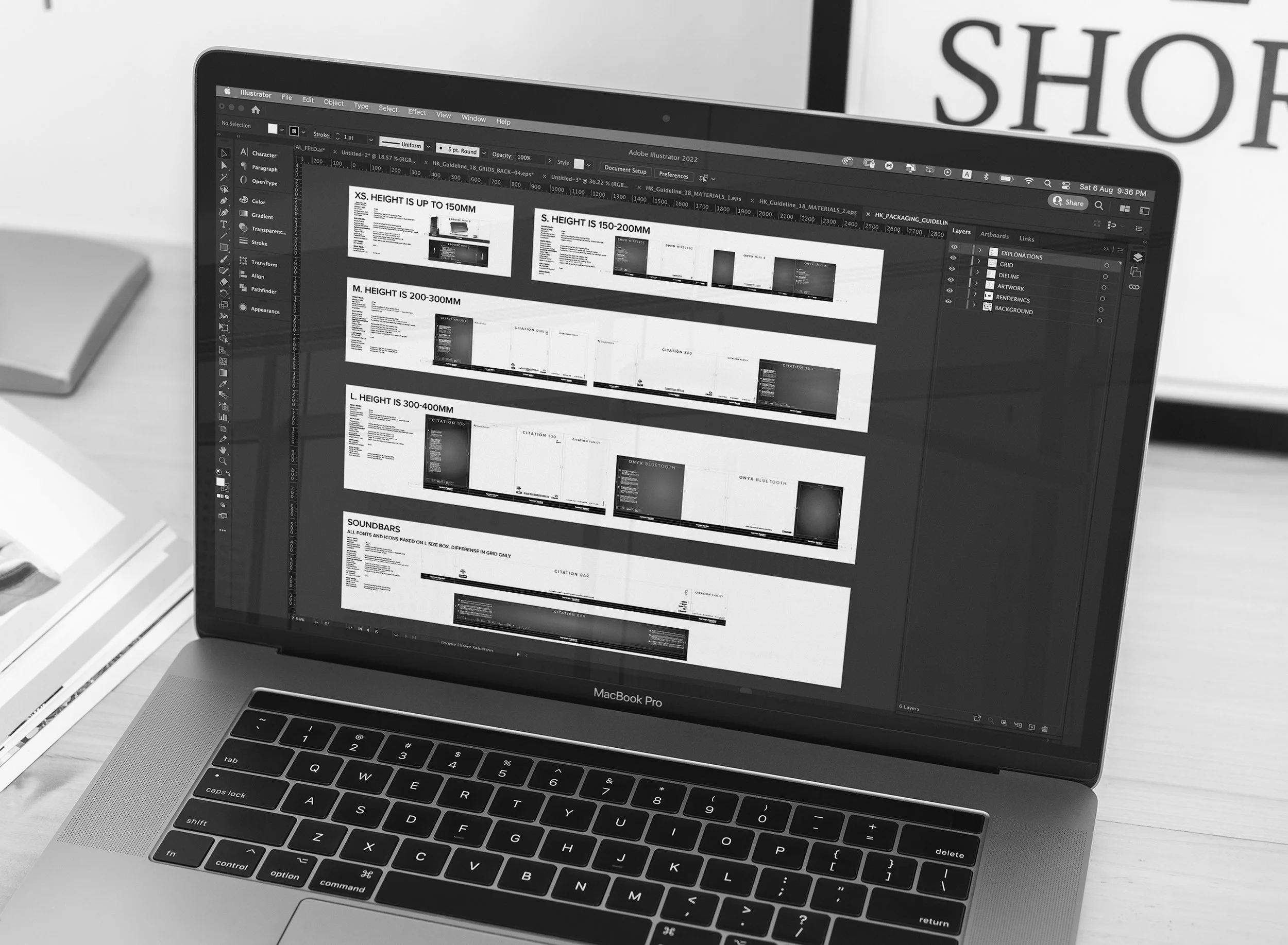
Packaging Guidelines
Guidelines Book And Presentation
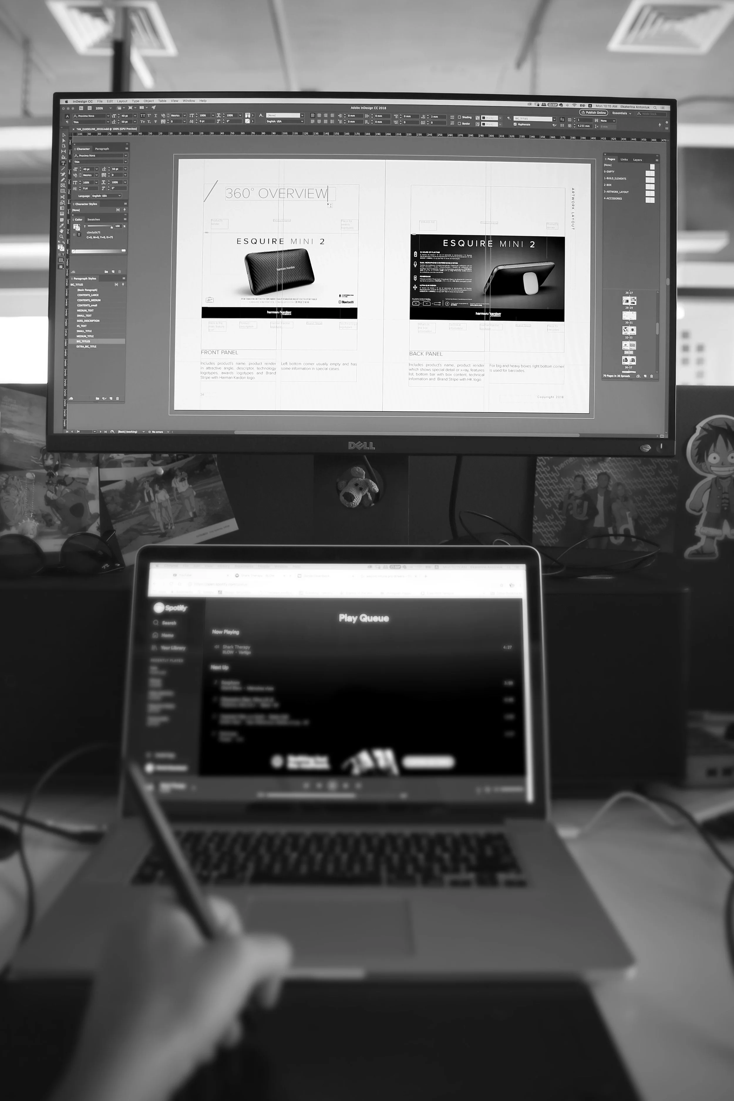
Packaging Artwork Layout
DURATION
02-06.2018
MY ROLE
Senior Graphic Designer

ABOUT
Harman/Kardon is a premium lifestyle, professional, and car audio brand.
PROBLEMS
No packaging guidelines.
Outdated assets libraries.
Inconsistency in packaging artwork layouts.
GOALS
To update and refresh famous Harman/Kardon look.
To unify the brand voice across the graphic elements, packaging artwork layout, and user experience.
ICONS
Together with UIUX team we created a set of icons that was going to be used for packaging, user manuals, and product interface design.

TEMPLATES
I made templates for other designers to easily create new artworks.

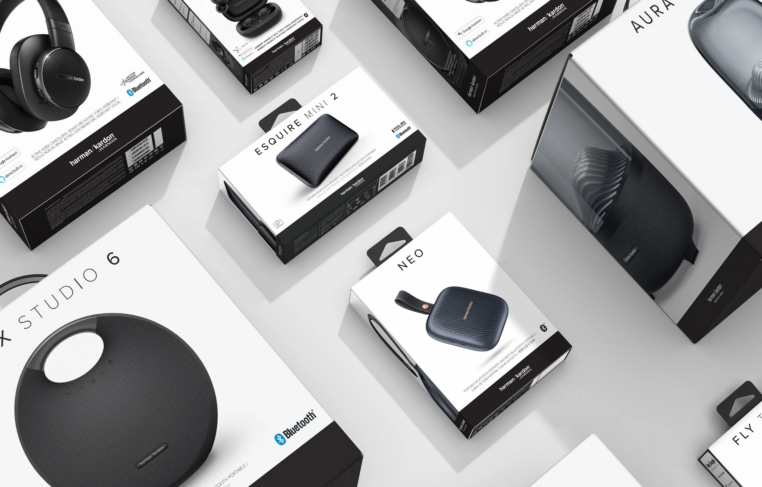
FINAL PRODUCT

THE PROCESS
RESEARCH
In collaboration with traffic managers, I collected all existed information about:
Packaging structures,
Packaging materials,
User Manuals (QSGs),
Graphic Elements,
Product renders.
ANALIZE
In collaboration with UIUX team, Industrial design team, and Render team I made a list of all elements that need to be refreshed and/or unified.
IDEATE
Based on that information I created a new packaging guidelines proposal and approved it with an art director.


DESIGN
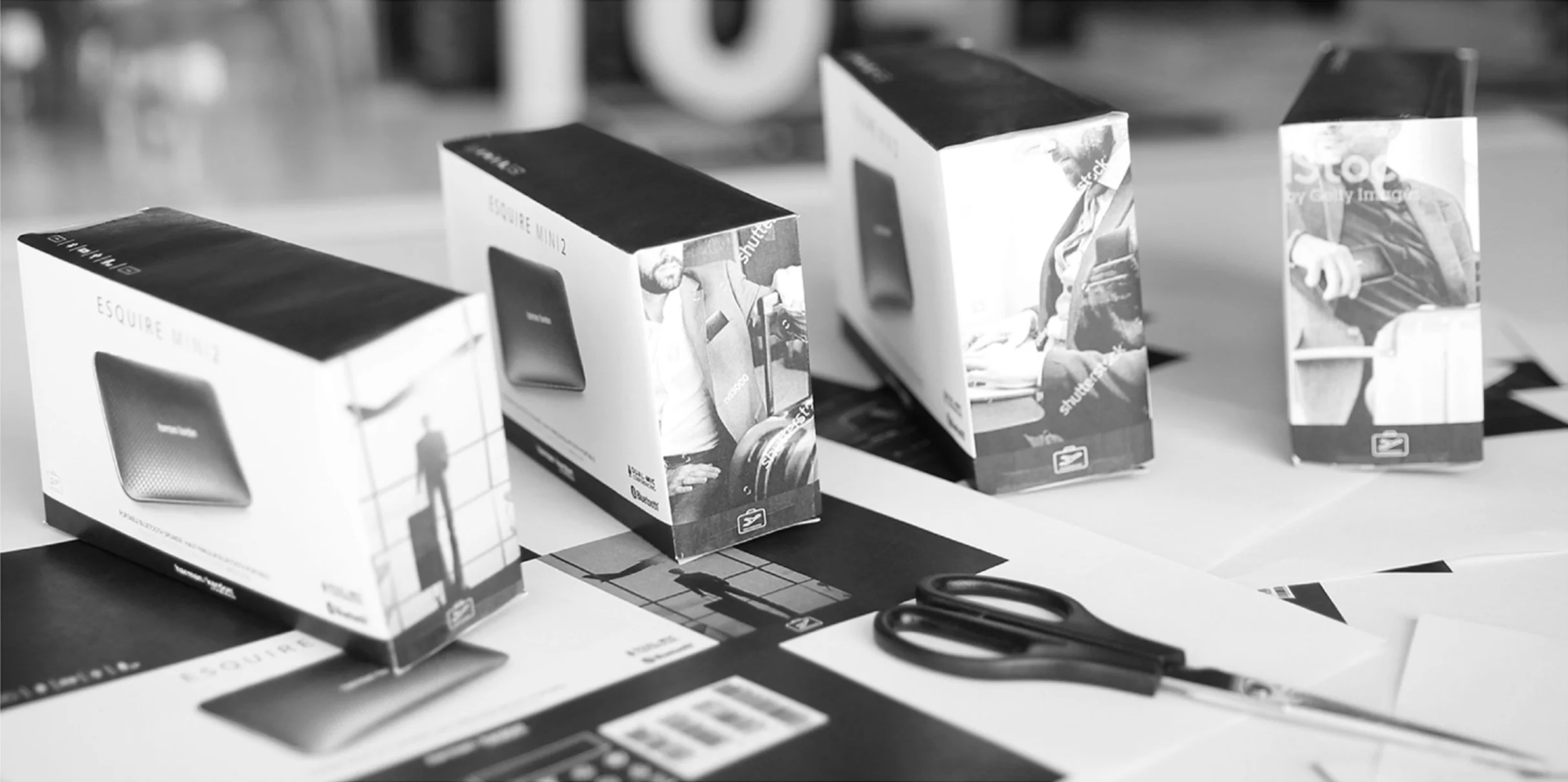

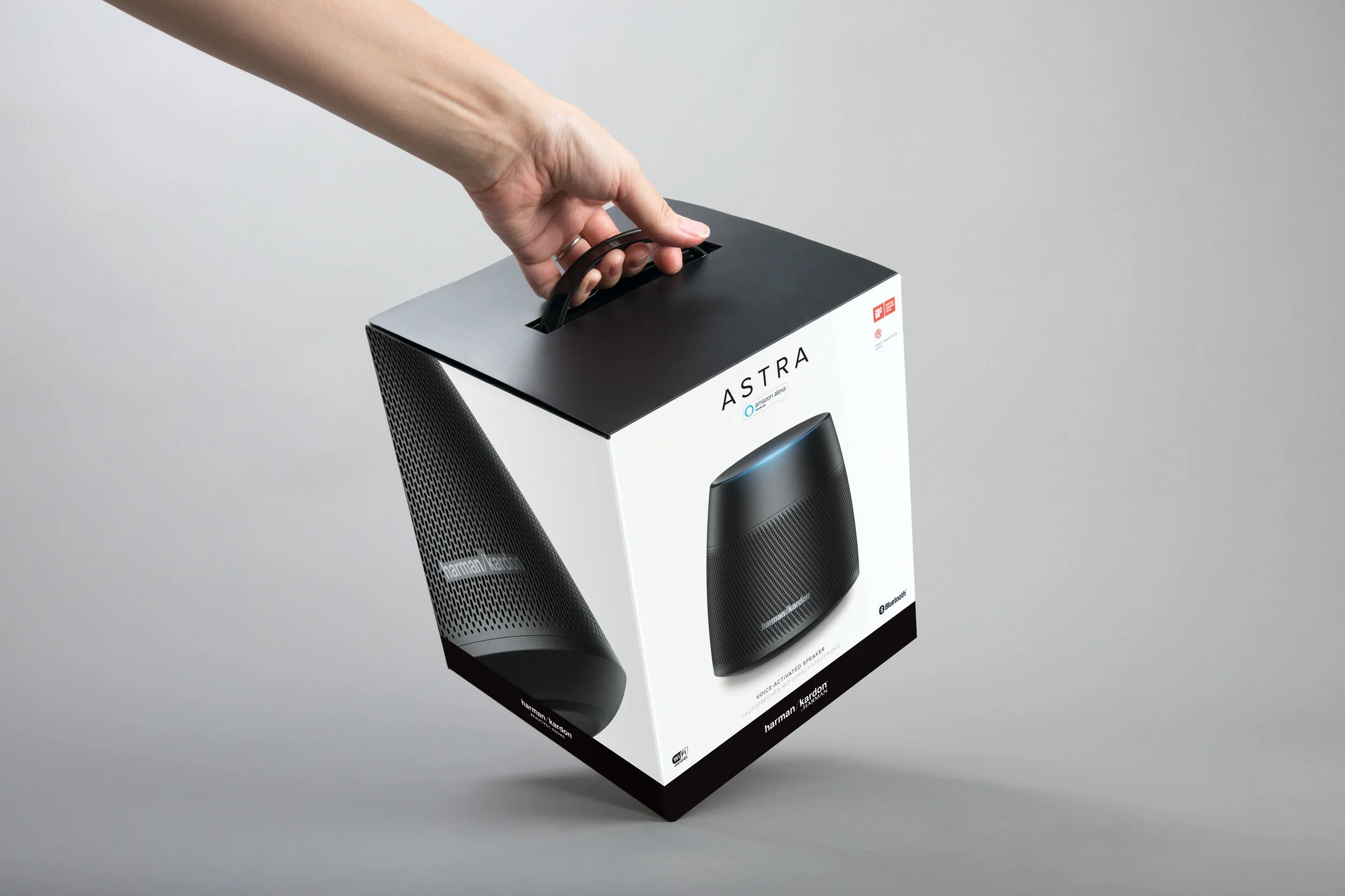
PACKAGING
I created a packaging design system for all kinds of Harman/Kardon products, that included:
Updated fonts and graphic elements,
Packaging structures, and artworks,
Inside the box materials.
THE GUIDELINES
I combined all the information in a guidelines book and a digital presentation.
USER MANUALS (QSGs)
In order of consistency and budget saving, I made one-size user manuals for all products.


